What are the global warming stripes?
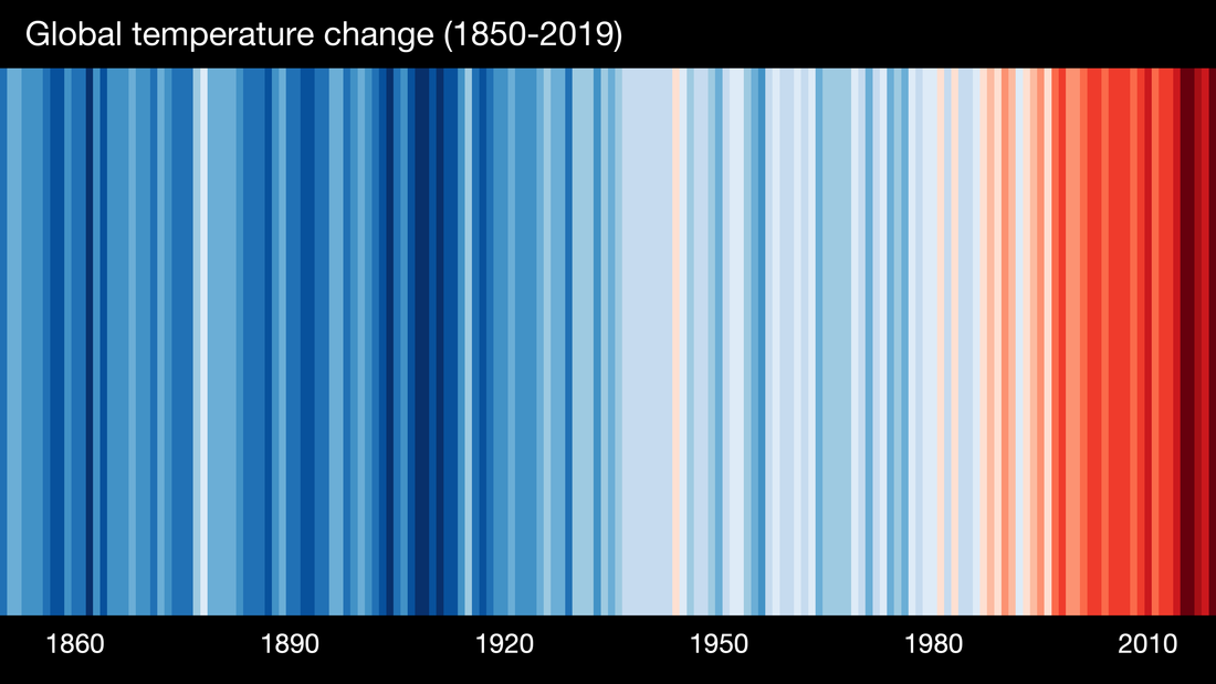
We are all familiar with how the globe has warmed since the industrial revolution. The global warming stripes are a visual representation of how the average global temperature has increased since 1850. Each stripe represents the average temperature for one year and you can see how they gradually change from blue (cooler) to red (hotter). They were originally created by a scientist, Prof Ed Hawkins and you can find more details at his website, https://showyourstripes.info/.

At pritygrity we pride ourselves on doing all we can to be part of a more sustainable future. We were inspired to incorporate the Warming Stripes into some of our designs; not only do they communicate one of the most important challenges facing the world, they look great too.